


I Like To KISS
If you have read any of my other blog posts, you'll know I like to keep things simple stupid (KISS) and get straight to the point. Flexbox is essentially a way that allows a container to best fill the space available. The rest of the background of Flexbox is a bit boring so we'll skip and get into some code & examples 😁
How Do I Use a Flexbox?
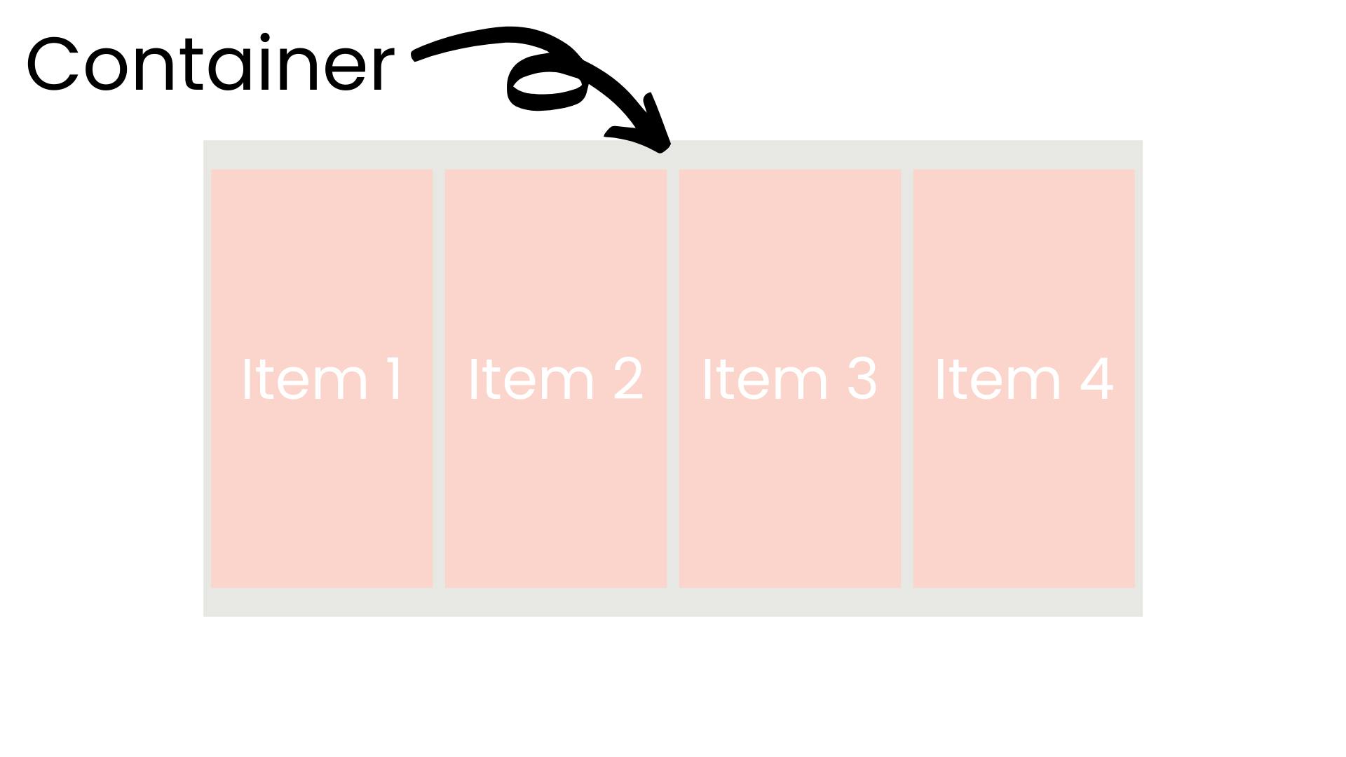
To set a container to use flexbox we use the CSS property "display" and set the value to "flex"; this will enable a flex context for all its direct children. We now have a flexbox container! Congrats! 🥳
.flex-container {
    display: flex;
}
What Now?
There are a number of properties that we can set in order to manipulate the behaviour of our flexbox. Let's take a look at some of these:
Properties for flexbox container
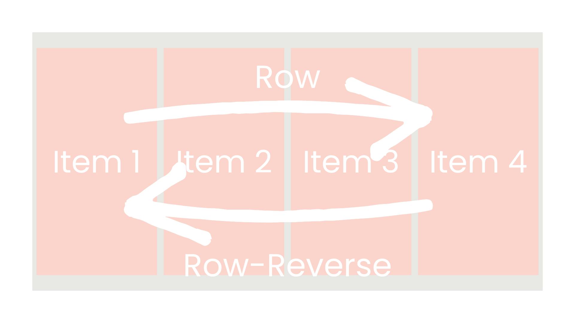
flex-direction This is how we define if the flexbox's items will be displayed vertically (column) or horizontally (row). We can also set the items to be displayed in reverse by suffixing the property value with "-reverse".
.flex-container {
    flex-direction: row | row-reverse | column | column-reverse;
}
flex-wrap By default, flexbox will try to put all items onto a single line regardless of the container boundary. We can change this by adding a property to the flexbox container, flex-wrap.
.flex-container {
    flex-wrap: nowrap | wrap | wrap-reverse;
}
- nowrap (default): all flex items will be on one line
- wrap: flex items will wrap onto multiple lines, from top to bottom.
- wrap-reverse: flex items will wrap onto multiple lines from bottom to top.
flex-flow flex-flow is a shorthand that amalgamates both flex-direction and flex-wrap.
.flex-container {
    flex-flow: column wrap;
}
Properties for flexbox children (flex items)
order By default flex items are displayed in the order that they appear in the flexbox container. However, we can control the order in which they are displayed with the "order" property. Any items that have the same order value will display in the order they appear in the flexbox container.
.flex-item {
    order: 5
}
flex-grow flex-grow allows an item to grow to fill the space of its flexbox container; a unitless value that acts as a proportion to the other flex items in the container. If all items have a value of 1 the remaining space in the container will be distributed evenly to all children. If one flex item has a flex-grow value of 2 then this item will occupy twice as much space as items with a value of 1.
.flex-item {
    flex-grow: 1
}
The Real Reason People Use Flexbox
Centering an item!
To center an item inside a flexbox we need to have a couple of things. Firstly we need a flexbox container, then we need at least one flex item.
.flex-container {
    display: flex;
}

.flex-item {
    width: 100px;
}
<div class="flex-container">
    <div class="flex-item">
        Item #1
    </div>
</div>
Now we need to add a property to center the flex item horizontally; we'll use "justify-content" to do that! Lets add that in to the flexbox container css.
.flex-container {
    display: flex;
    justify-content: center;
}
Perfect! We've centered the item horizontally. Now let's center it vertically. To do this we'll use the "align-items" property in the flexbox container CSS. We'll also add some height to the container so we can see the centered working correctly.
.flex-container {
    min-height: 500px;
    display: flex;
    justify-content: center;
    align-items: center;
}
Don't believe me that this actually works? Here's a codepen for you to see it in action and you can have a play around with the different values.
Other Values For Flex Positioning
Flex is great to center an element horizontally and vertically inside a container but there are other values we can set to change the display of the flex items.
Justify-Content
- flex-start (default): items are shifted towards the start of the flex-direction.
- flex-end: items are shifted towards the end of the flex-direction.
- start: items are shifted towards the start of the writing-mode direction.
- end: items are shifted towards the end of the writing-mode direction.
- left: items are shifted towards the left edge of the container unless that doesn’t make sense with the flex-direction, then it behaves like a start.
- right: items are shifted towards the right edge of the container unless that doesn’t make sense with the flex-direction, then it behaves like an end.
- center: items are centred along the center line
- space-between: items are evenly distributed
- space-around: items are evenly distributed with equal space around them. Note that visually the spaces aren’t equal, since all the items have equal space on both sides. The first item will have one unit of space against the container edge, but two units of space between the next item because that next item has its own spacing that applies.
- space-evenly: items are distributed so that the spacing between any two items (and the space to the edges) is equal.
Align-Items
- stretch (default): stretch to fill the container (still respects the min-width/max-width)
- flex-start / start / self-start: items are placed at the start of the cross axis. The difference between these is subtle and is about respecting the flex-direction rules or the writing-mode rules.
- flex-end / end / self-end: items are placed at the end of the cross axis. The difference again is subtle and is about respecting flex-direction rules vs. writing-mode rules.
- center: items are centred vertically
- baseline: items are aligned such as their baselines align
Feedback Time
I'd love to know your thoughts on this article! Don't forget to leave a reaction so I know if you enjoyed it! Aaaaand come say hello on Twitter! @SimonDoesCoding